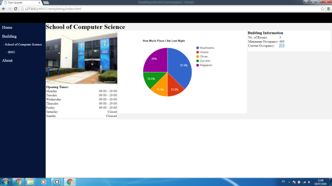
Getting your Python 3 Flask App to run on Apache

Hey everyone! I’m aware that a good few of the groups will be using Flask for this project and I thought I’d write this little tutorial about how to get your Flask app up and running on an Apache server. I had some issues with getting this to work with Python 3 so hopefully you will find this useful.

Getting Started

To my knowledge this isn’t required but for the sake of convenience I changed the python alias to automatically run python 3:

alias python=python3

Now the first thing we need to do is get an Apache server on our machine. This is pretty easy through the commands:

sudo apt-get update
sudo apt-get upgarde
sudo apt-get install apache2

Flask uses something called mod_wsgi in order to communicate with the Python interpreter in order to run Python scripts. We’ll want to install and enable this mod:

sudo apt-get install libapache2-mod-wsgi-py3

The mod should be enabled automatically for you but if it isn’t just type the command:

sudo a2enmod mod-wsgi

Finally we just have to restart the server:

sudo service apache2 restart

Creating a Flask Application

So now we have our Apache server installed with the mod enabled. Now let’s get a simple Flask app up and running. I’m just going to use the sample app directly from the Flask app documentation but feel free to put in any app that you’ve already written.

from flask import Flask
app = Flask(__name__)

@app.route('/')
def hello_world():
    return 'Hello, World!'

Generally in Apache, HTML files to be loaded on the server are stored in ‘/var/www/’. You don’t have to use this directory but for the sake of convenience that’s what I used. So let’s make a new directory and call it flask:

cd /var/www
sudo mkdir flask

Then create the python flask app and just copy and paste the simple flask script from above in. I’m running Linux so I can do this through a text editor but if your accessing your server directly through SSH on you can just use nano:

sudo touch flaskapp.py
sudo nano flaskapp.py

Trying to run this application now won’t work as we’ve yet to install Flask. Again, I had issues with conflicting directories so I made sure that I installed Flask in the python 3 directory and ran it using python 3. To do this I used pip3:

sudo apt-get install python3-pip
sudo pip3 install flask

Once you’ve run these, entering the following command should run your python script and you should be able to see ‘hello world’ in your browser through http://127.0.0.1:5000

python /var/www/flask/flaskapp.py

Getting Flask to run on Apache

So at this point you should have a simple Flask App that can run and be seen through the browser and an Apache server that’s running. By default, the server will always be running but if you’re unsure you can check the status through the command:

sudo /etc/init,d/apache2 status

If it’s not running just type:

sudo /etc/init.d/apache2 start

Our next step is to create a mod_wsgi file that our Apache server will use to run our Flask App. We can create it in the same directory as our original app:

cd /var/www/flask
sudo touch app.wsgi
sudo nano app.wsgi

Then just copy and paste this into the wsgi file:

import sys

sys.path.insert(0, '/var/www/flask')
from flaskapp import app as application

Next we need to create an Apache configuration file in order for Apache to know where our wsgi file is. Go to the Apache sites-available directory and add the configuration file:

cd /etc/apache2/sites-available
sudo touch flask.conf
sudo nano flask.conf

This is a really simple configuration file that should work for the moment to get the flask app running on your localhost:

<VirtualHost *>

ServerName localhost

WSGIDaemonProcess flaskapp user=<username> group=<username> threads=5
 WSGIScriptAlias / /var/www/flask/app.wsgi

<Directory /var/www/flask/>
 WSGIProcessGroup flaskapp
 WSGIApplicationGroup %{GLOBAL}
 WSGIScriptReloading On

Require all granted
</Directory>
</VirtualHost>

Remember to replace <username> with the username your using on your machine. Finally we just need to make sure that flask.conf is the only config file the Apache server is trying to host.

sudo a2dissite 000-default
sudo a2ensite flask.conf
sudo service apache2 restart

At this point your server should be running and you should be able to type localhost into your browser and see ‘hello world’. Note that at this point your actual flask app shouldn’t be running, everything should be hosted by Apache.

Well that’s it. I hope that this will help some of you trying to get flask setup on Apache. If you’re having any issues feel free to come and ask me or drop me a message.

These are some external resources that I used in trying to get this working and for making this tutorial:
http://flask.pocoo.org/docs/0.11/deploying/mod_wsgi/
http://terokarvinen.com/2016/deploy-flask-python3-on-apache2-ubuntu
https://www.digitalocean.com/community/tutorials/how-to-deploy-a-flask-application-on-an-ubuntu-vps

Troubleshooting

If you’re getting 500 Internal Server error then you should check the logs to see what exactly is going wrong to see if you can fix it. The main problem I had to deal with was:

ImputError: No module named ‘flask’ 

This took me the longest to figure out as my flask app was running in isolation so I didn’t see why it couldn’t find the module. If you followed this tutorial, then you shouldn’t get this problem (I hope) but if you do then it most likely means that Apache is looking for the flask module in the Python 2.7. Hopefully just entering ‘sudo pip install flask’ should solve this.
Presenting Your Data with Charts.js

Hey all! So I imagine at this stage at our project that most groups are focusing on developing and finishing the front-end side of our web apps. I decided to make this little guide about how to go about using Charts.js to visualize your data and make your website look awesome.

Firstly let’s look at a basic script that allows us to create a simple line chart.

<!DOCTYPE html>
<html>
<head>
 <title>Chart Demo</title>
 https://cdnjs.cloudflare.com/ajax/libs/Chart.js/2.1.6/Chart.bundle.js
</head>
<body>
 <canvas id="lineChart"></canvas>
 
 var ctx = document.getElementById("lineChart");
 var chartDemo = new Chart(ctx, {
     type: 'line',
     data: {
     labels: ["09:00","10:00","11:00","12:00","13:00","14:00","15:00","16:00"],
     datasets: [{
         fill: true,
         label: '# of mobile devices',
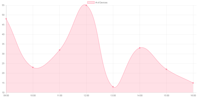
         data: [48,23,32,55,13,33,22,15],
         backgroundColor: 'rgba(255, 99, 132, 0.2)',
         borderColor:'rgba(255,99,132,1)',
         borderWidth: 1
     }]
     },
     options: {
     }
 });
 
</body>
</html>

The above code should produce the following graph:

firstchart

As you can see it’s quite easy to get Charts.js up and running. If you want to produce a different type of chart just change the ‘type’ field in the chart configuration. For example, changing ‘line’ to ‘bar’ in the type field for this graph would produce a basic bar chart. Note that for some of the other chart types the data and options field are different. For other charts please refer to the documentation.

Adding more Data

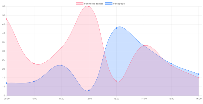
Now suppose that you wanted to add more data sets to show, for example,  the number of mobile devices against the number of laptops in a room at any one time, we can do that buy appending the ‘dataset’ field in the chart config.

data: {
    labels: ["09:00","10:00","11:00","12:00","13:00","14:00","15:00","16:00"],
    datasets: [{
        fill: true,
        label: '# of mobile devices',
        data: [48,23,32,55,13,33,22,15],
        backgroundColor: 'rgba(255, 99, 132, 0.2)',
        borderColor:'rgba(255,99,132,1)',
        borderWidth: 1
     },
     {
        fill: true,
        label: '# of laptops',
        data: [12,13,22,8,43,33,23,17],
        backgroundColor: 'rgba(0, 102, 255, 0.2)',
        borderColor:'rgba(0, 102, 255,1)',
        borderWidth: 1}]
 },

Now we can show two sets of data on the same chart:

secondchart

Customizing the Chart

One of the key benefits of using Charts.js over other charting libraries is it’s flexibility and customization options. All chart customization occurs in the options field of the chart configuration.

If you’ve run the above code and a chart is appearing on your screen, you might notice that if you reduce the width of your browser window, both the height and width of the chart reduces. This is because by default the canvas element tries to maintain it’s original aspect ratio even when the browser window is resized. Although this is a cool feature, it makes it difficult to predict the chart size on smaller devices so we probably want to turn this feature off.

options: {
    maintainAspectRatio: false,
    responsive: true
}

Now the height of our chart will remain constant but this means we have to manually set the height of our canvas element. It’s important to note that by default, a chart will use 100% of the height and width of it’s parent element so I’ve found the easiest way to control the size of my charts is to encapsulate them into a div and then style the div the way I want to:


Now let’s do some more customization. Suppose we want our lines to be straight and we want a title above our chart. Again, this requires us to edit the options field of our chart configuration.

options: {
    maintainAspectRatio: false,
    responsive: true,
    title: {
        fontSize: 15,
        fontFamily: "'Helvetica Neue', 'Helvetica', 'Arial', sans-serif",
        display: true,
        text: "Average No. of Mobile Devices and Laptops"
    },
    elements:{
        line:{
            tension: 0
        }
    } 
 }

Now our final chart should look like this:

thirdchart

I hope this blog post has helped you somewhat get familiar with how Charts.js works and how you can use it for your site. For this demo I’ve only introduced a handful of the options each chart has. You can find a full list over at the Documentation if you’d like to learn more.

Unit Testing in JavaScript

Hey everyone. I imagine as the project is coming to a close most groups are finishing up their projects and making sure that everything is running properly. I’ve been looking into some ways of unit testing JavaScript code and I’ve come across a library that I thought some people might find useful for doing some final testing of the their code.

QUnit

QUnit is a JavaScript unit testing library that is used in the development of JQuery. It’s really simple to use and allows you to quickly create and look at the results of your unit tests through a nice web interface.

Writing the Tests

Tests are really simple to write. QUnit provide a nice template that presents the results of your tests on a webpage. The template can be found below:

<!DOCTYPE html>
<html>
<head>
<meta charset="utf-8">
<meta name="viewport" content="width=device-width">
<title>QUnit Example</title>
<link rel="stylesheet" href="https://code.jquery.com/qunit/qunit-2.0.1.css">
</head>
<body>
<div id="qunit"></div>
<div id="qunit-fixture"></div>
<script src="https://code.jquery.com/qunit/qunit-2.0.1.js"></script>
<script src="tests.js"></script>
</body>
</html>

Next we’ll move on to actually writing the tests. In the same folder that you’vesaved the above example, create a file called tests.js. To give an example, below shows a really simple unit test of a function that sums all the numbers up to 10:

QUnit.test( "countToTen", function( assert ) {
 var sum = 0;

 for (var i = 0; i < 10; i++){
 sum += i;
 }
 assert.equal(sum, 45, "Correct!" );
});

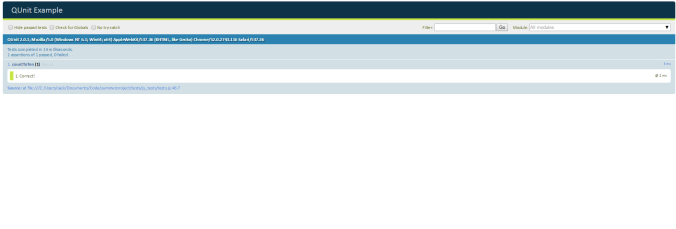
So now when we open up the HTML template we get the following:

qunitexample

This info should be all you need to get started making your JS unit tests. If you’d like to know more you can head over to the QUnit website and check out their documentation. Hope this helps!

Week 11 Recap: The End!

This blog post marks the end of the final week of the project. In terms of working on the actual product, we did very little this week. We spent some time making sure that it was working OK on the server for the sake of our demonstration but beyond that we didn’t change anything. We have been spending a lot of time doing our group report though. We designated a specific section to each person in the group. Since I was responsible as the customer lead for this project I took on the first section which was regarding the product requirements. I talked about our initial vision for the product and the requirements that we came up with based on what we thought the final product should be. I also presented on this section in our final presentation which happened this week. It basically summed up our every aspect of our product such as design, development and testing and included a brief demonstration at the end. This week we also had to perform an elevator pitch in front of some external developers from industry. Don and Pauline agreed to do the pitch and it went really well. They asked a lot of questions regarding our mobile application, so it was nice to see some interest from people with experience about one of our innovations.

Overall I’ve found this project quite enjoyable. It’s really nice to be able to apply what you’ve learnt in previous semesters and come up with a product that serves an actual purpose. I also feel like I’ve improved a lot as a developer in the last 11 weeks. I’ve learnt how important good organisation and research can be before the development process and save you a lot of time down the road. Teamwork has also been a key factor in our groups success over this semester. I feel that your team;s dynamic really shows up in the end product and it’s important that you and your teammates are on the same page at all times. I’m really proud of what we’ve produced and I’ll be adding it on to my portfolio for future employers to see. Going forward, I’m hoping to apply what I’ve learnt to some of my personal projects as well. I’ve been developing some basic web applications in my spare time and what I’ve learnt about server deployment and responsive design are really going to come in handy.


Week 10 Recap: Testing and Squashing Bugs

So we’re coming towards the end of the project and our group is beginning to wrap things up. This week was the last week that that we would be working on the project as we had to focus some time on writing our report and getting ready for our final presentation and elevator pitches.

This week I focused on tidying up the UI. Myself and Don we’re both working on different parts of the front-end website and we had some inconsistencies with our page styling. We had a meeting before the weekend in which I agreed to develop a new cleaner layout for the website and apply it across all of the pages. Unfortunately, I ended up scrapping the dashboard design that I had worked on creating and exchanged it for a more standard minimalist look. I feel that overall the website does look better know and the mobile version of the site has also been improved.

new page layout

As well as tidying up the UI I began on running some final tests on my code. I have written a considerable amount of JavaScript code for the project and most of it has involved the use of external libraries which made it hard to test. I did however write some functions for calculating occupancy statistics on the client-side which I felt testing was appropriate. The testing library I ended up using was QUnit. It’s used in the development of JQuery and it provides a really easy way to create unit tests for JS code. I wrote the tests and made sure that they were all passing. I also made sure that the HTML pages were validated using the W3Schools HTML validator service to make sure that there was no serious mistakes in the markup.

Now that the actual project is more or less finished, I’ll be focusing entirely on the report. We also have a final presentation and elevator pitch to prepare for. We have a busy final week ahead.


Week 9 Recap: Innovations and Final Prototype Presentation

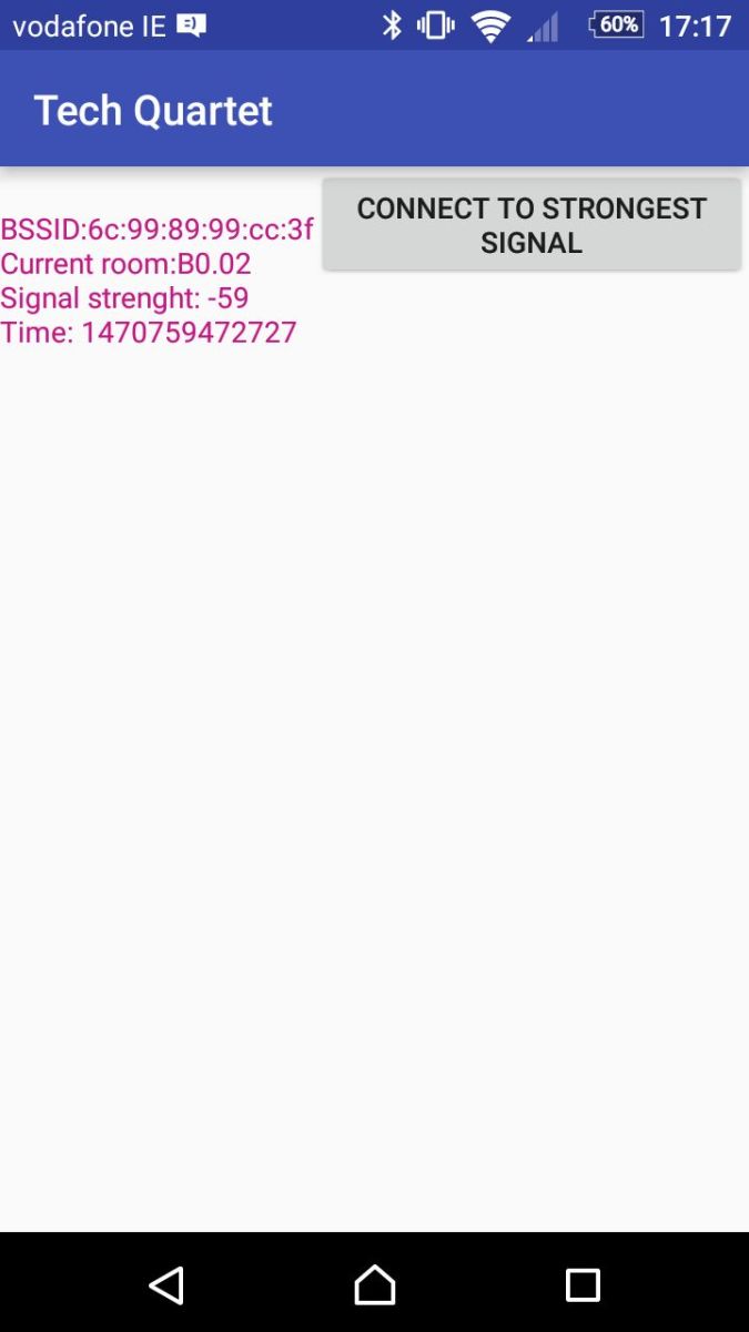
Our focus for this week was tidying up our UI, testing and implementing our innovation. We decided to implement a basic Android App that could specifically identify the room a person was in based on the WiFi router they were connected to. We finalized the idea last Friday and over the weekend Pauline created a basic Android App using Android studio that presented the MAC address of the clients router on screen. We then spent Monday testing the app around the computer science building to see how accurate was and to squash any bugs. Overall, we found that for the rooms considered in this project, a smartphone will generally connect to the access point that is located within the room. A few exceptions occur like when the user moves from one room directly to the next in which case they may still be latched on to the previous AP, or if the room is especially big like B004 in which the rooms AP is located at one end of the room and is hard to pickup from the other end. In order to solve this we came up with the idea of putting a refresh connection button into the app.

app-screenshot

When pressed the app will look again for the closest AP (determined by signal strength) and latch on to that. The main purpose for the app is that it allows us to make sure that when a lecturer/TA wants to submit ground truth data to the database, that they are in fact in the room in which they’re submitting the data for. This prevents invalid data from being entered into the database. One of the ideas also brought up in the presentations this week was that we could use our app as a means students signing into classes which is also a great idea.

This week all of the groups presented their final working prototype to the class. It was really interesting to see some of the different directions that the different project groups took with the project. In general, most groups had a similar core product that allows users to login and view the historical log data on a series of graphs and submit new data via an upload page. It was nice to see that each group seemed to have something that set them apart whether it was the implementation of an Android app or a unique data analytics approach. For me, it was definitely the most interesting week for presentation that we’ve had thus far and I’m really looking forward to seeing the rest of the groups final presentations as well!

After the presentations our group was motivated to keep going and add some last minute functionality into the product. We think we’re going to give ourselves a few more days of working solely on finishing the product and then get moving with the report. Since last week I’ve implemented the remaining features of the website. What’s left is a bit of styling, testing and error handling. When all this is done I’m going to see if I have enough time to work on a activity log section for the dashboard. This will scan the database for recent ground truth data submission and display them in real time as they happen on the dashboard. I’m hoping I’ll have enough time to get it finished put I feel tidying up what we have so far is more important. I’ve also be doing a blog post on Charts.js for anybody that is hoping on trying it out for their website!


Week 8 Recap: Finishing the UI and Innovations

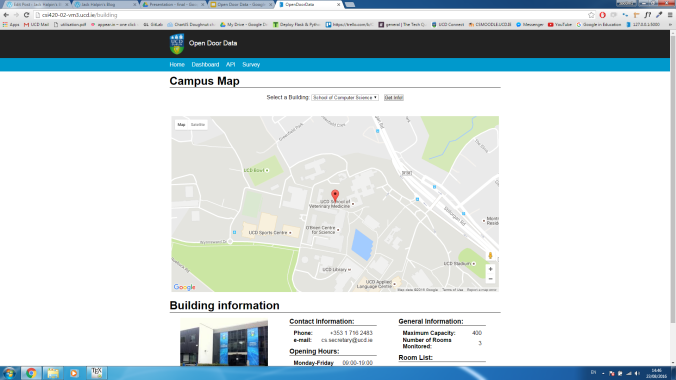
This week I’ve been focusing on finishing up the dashboard UI. It’s taking longer than expected. I’ve finished the layout of the building page that gives users basic information about buildings on campus. I’ve completed the template for it so now I have to write the queries to get the building information from the database and use JavaScript to display it on the site. I’ve also worked on making the website more responsive. I learned how to use media queries and the site now looks great on mobile devices. I’ve also made a responsive navigation bar and I love how it turned out.

responsive

I know other groups have mentioned using Bootstrap for their front-end. In hindsight, using bootstrap would have saved me a lot of time in making the dashboard UI, but I’m glad I stuck it out and did it from scratch. I learned a lot and really felt like my HTML, CSS and JS have improved a lot.

We’ve been discussing more about innovations this week. We’ve come up with a few ideas such as exporting data to PDF format, making an Android app and implement a system that checks that users submitting data via the survey page are in the room they are supposed to when submitting the data. Time is running out so we’re hoping to have an idea picked by the start of next week so we can begin implementing it. Until then I’ll keep working on finishing the UI. I’ll hopefully have the remaining pages done by this weekend so I can focus solely on our extra innovation and the report for the remainder of the project.

Week 7 Recap: Integrating our model

Last week Elayne and Pauline managed to get our data analytics model completed so we spent this week trying to integrate the model into our website. In order to do this, we had to make a decision on how the data shown to our users would be calculated. Our first approach was to pass some parameters such as the room number and date to our controller, query the data and then run the model on this data and return the results and present them on the site. When we did this we found that returning the results to the webpage took quite some time which is obviously not ideal.

In order to fix this we decided that since our model is based solely on the number of devices detected in the room, it only has one coefficient to be calculated. It would be much quicker to run the model once, calculate the coefficient and then store it in a database to be accessed at any time. Doing this made our web app much quicker to respond to queries so we’ve decided to go down this route. We feel that in a future version of the project where data would be fed into the database on a regular basis, we would have the coefficient be updated each time new data is added, or on a set time interval to make sure that the most accurate results are being displayed to the user.

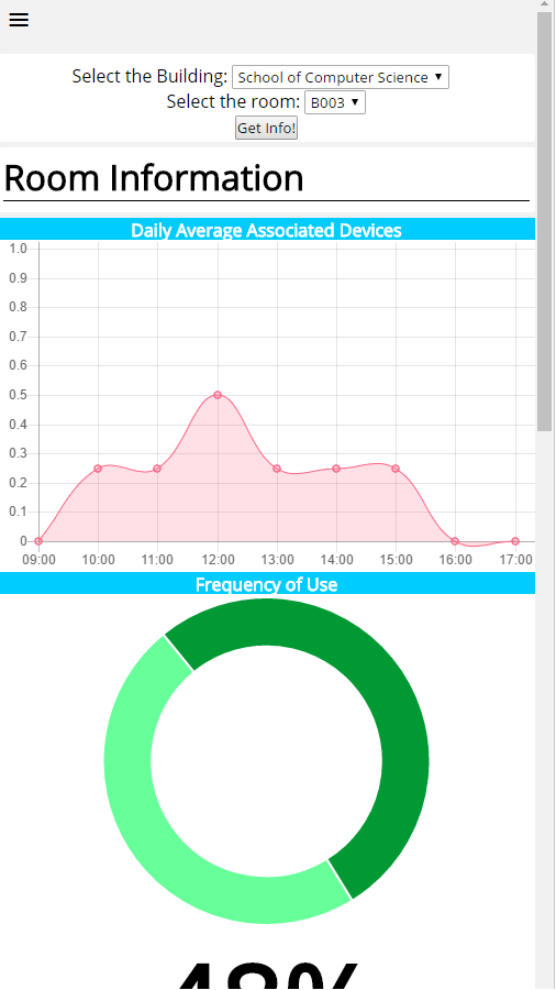
general_info

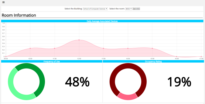
I’ve spent a lot of this week redoing the webpage. All the charts were creating using charts.js and I think they look really nice! A user can click on any building and room that’s available in the database and get general information about the room. Right now, the page displays the hourly average occupancy according to our model for all days recorded for the room selected. It also shows the frequency of use of the room and the overall occupancy rating. The user can now also click on a specific date and see hourly information for that particular day if they require.

historical_info

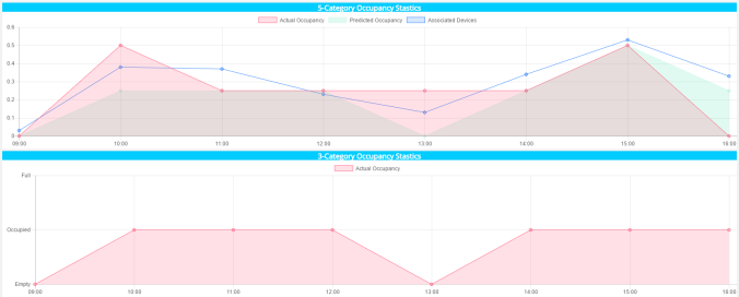
I like how the page turned out. One thing I’ve found with web development is that you can spend countless hours on a webpage and still not be completely satisfied so for the time being I’m going to leave the page as it is and move onto filling out the other pages on the dashboard. I’m going to implement a building page that will show some general info about buildings around campus and a modules page which will allow lecturers and admins to see the estimated attendance in lectures.

Our discussion session this week revolved around our innovations and features we were implementing that go beyond the core scope of the project. For now, we have an API that anybody can query to access occupancy information from our database and a  survey page that allows users to submit ground truth data. Although the discussion went well, we got the impression that we should be doing more to make our project unique so I think we’ll brainstorming some ideas that we could add to the project. For now, I’m going to work on finishing up the front-end as soon as possible. I still need to implement the rest of the pages and then make the site responsive using media queries which is something I haven’t done before so I’m looking forward to playing around with them.


Week 6 Recap: More UI Work and Literature Review!

We’re into week 5 of the project now and we can see things starting to come together slowly but surely. We’re now beginning to combine the various individual components of our project together and it’s really exciting. When starting the project we split the main tasks (data analytics, interface, back-end, database etc.) among ourselves in order to be more productive. We’ve been keeping on top of everything by having meetings every other day which has really helped to make sure that everyone is on the same page. Now we’re all coming together again to combine all of our work to hopefully make a decent prototype to present at the end of the summer. I’ve recently been focusing on the front-end of our project. The dashboard display we decided to use for our users is coming along. I’m learning a lot of about web development which is great because it’s something I’m considering pursuing once the course has finished!

At the end of last week I had a really basic prototype of the dashboard built. In order to get some inspiration I’ve been looking around at some other dashboards online. This particular site caught my attention. I thought the design was really nice and overall it had a really neat appearance. I decided to redo the prototype using that site as a template. I had an internal debate about whether or not to keep using Google charts. Although they were easy to use I decided to go with charts.js. I want to learn as much as I can while doing this project so I said I might as well use a library I’ve never used before. I really like the way the charts looks and there’s loads of different types of chart to choose from. I think it’ll make our site look much nicer!

The rest of my time this week has been going towards getting the first draft of my literature review done. It’s a slow process but the initial research we did as a group in week 1 is really helping. I’ve been reading through quite a few papers trying to find relevant ones to our project. From what I can tell, there’s been no system that currently exists that solely uses WiFi to accurately measure the exact number of people in a room. Most other systems seem to use PIR sensors or some other form of physical sensor that has be installed into the room. It’d be great if we could make a finished project that’s unique to what’s already been built.

This week, Pauline presented our teams progress with the data analytics component of our project. The presentation went really well. We managed to get really good results using a linear regression model. One of the questions asked at the end was about the alternative analytics methods we had researched and had we intended to implemented them into the project as well. This is one of the things we’ve discussed quite a bit as a group, especially at the earlier stages of the project when were doing research into some of the previous work done in this field. In some of the papers I’ve read there were some really interesting techniques used such as Bayesian Combination Forecasting and Markov Chains that managed to produce accurate models. I think the main issue with implementing something like this is that although in the future our product may have access to much more data samples, the data we’re working with isn’t enough to warrant implementing this type of model. Using a technique such as a Markov Chain probably wouldn’t yield much better results than a simple linear or logistic regression. We talked about it again after the presentation and decided that we might come back to it in the future but the main priority would be getting the components we had done thus far working together.

Week 5 Recap: The UI

Last week during our presentation we showed that all of the individual parts of our product model were working together. The database was up and running and our Flask app was up on our server and able to query the database and show some basic statistics on our front-end. Now that we have the basic elements of our product in place, we need to expand and improve on them so we can hopefully have a fully developed product at the end of the summer.

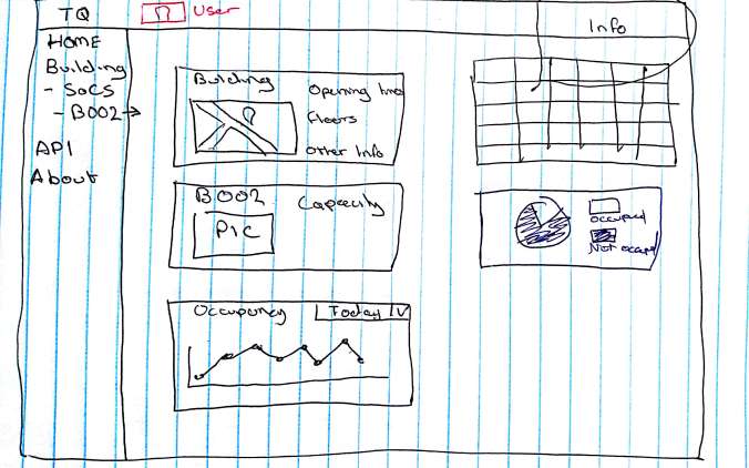
I made a really basic UI for the sake of demonstrating our first prototype but I had a look around at some online websites that offer data analytics solutions and a lot of them use dashboard like interfaces which I thought looked great and could possibly work for our product. At the meeting after our presentations I drew out a paper prototype of what I thought our website dashboard could look like:

Paper Prototype

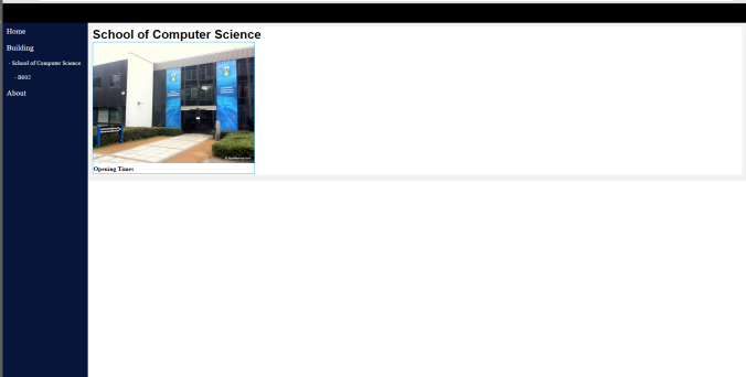
I feel like in a group project like this, paper prototyping is really important. It allows you to get your ideas across quickly to the rest of the team which is much better than going off and spending hours coding up a fancy dashboard UI that nobody really likes. The group agreed that the dashboard could work so I said that my task for this week would be to get it up and running. I first set out to create a basic layout for the dashboard:

Basic Layout

Once I had the layout then I wanted to see what it looked like with some more content on the page so I imported some google graphs to flesh it out:

third column

I feel that it’s beginning to take some shape. I’ve put google charts in the prototype because I feel that they’re the easiest to use but I think there are better looking chart libraries out there that I’m going to look into, probably Chart.js which I’ve wanted to play around with for a while.

The data analytics side of our project is doing really well. This week we managed to get up to 80% accuracy using a linear regression model which is awesome. I’m going to spend this next week finishing off the UI and hopefully begin incorporating our analytics model into some of the features that will be displayed to the user. I also want to replace google charts with charts.js charts which will hopefully make the site look a lot nicer!